


- Home
- Expert knowledge
- Blue shades
Darling: The wall colour in blue
Numerous colours are available for interior wall design. One colour direction is particularly popular: blue. Depending on the nuance, such as Ocean blue, pigeon blue, light turquoise, cobalt blue, petrol, night blue or Ice blue, shades of blue conjure up a fresh and fascinating atmosphere in every home. On this page, we explain how the blue wall colour affects people and the importance of the colour tone in interior design. We present the blue colour palette with numerous examples and give an insight into the variety of services from Caparol.
Blue stands for harmony and distance
According to recent surveys, blue is by far the most popular colour. Perhaps because it is the colour of the distant sky and the wide sea, blue is one of the cold colours. Are shades of blue still suitable for interiors? What effect does blue have on people and in interior design?
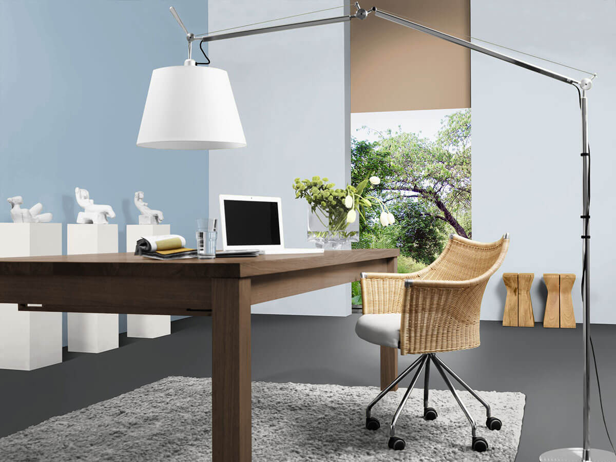
Psychological studies confirm that different shades of colour have different effects on the human psyche. The interior colour blue can appear cool, refreshing, clean, calm to serious - depending on the nuance. Delicately veiled pastel blue or deep dark blue accents create a calm, relaxed atmosphere that reduces nervousness and stress. Bright blue nuances spread a feeling of stimulating clarity and freshness - ideal for concentration in the study, for example.
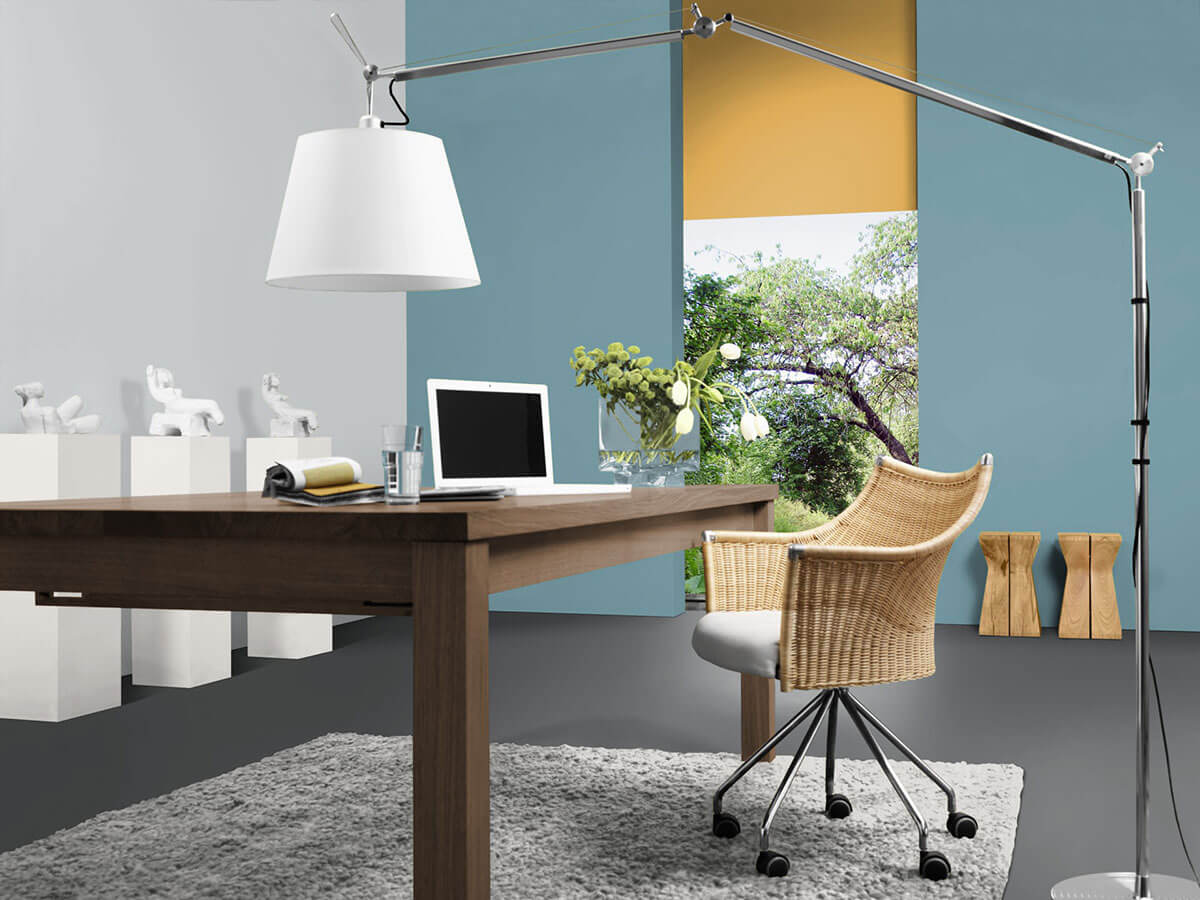
When painted with light blue wall paint, small rooms appear optically wider, as light blue tones appear light and distant. Dark blue nuances appear compact and ensure that a wall provides support and a room has more depth.
What is blue suitable for as a wall colour or accent?
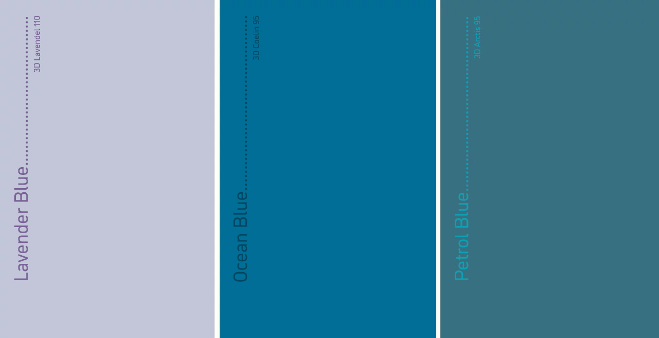
Due to the cooling and calming properties of blue, the colour is particularly well suited for rooms that serve rest and relaxation - for example, for bedrooms and guest rooms. Study rooms also benefit from clear, stimulating shades of blue, especially as a balance when there is a lot of wood in the room. Blue conjures up freshness and cleanliness in pantries and cold rooms, as well as bathrooms. Soft pastel tones from the yellowish blue range, such as light turquoise or reddish blue nuances such as lavender blue, are recommended for children's rooms, as they are perceived as less cool. The relaxed ambience helps babies and toddlers fall asleep.
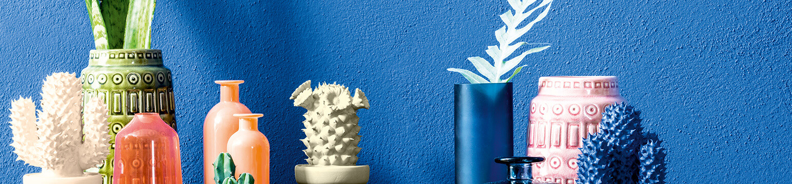
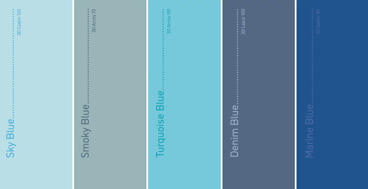
The colour palette blue
A colour palette shows the different tones of a colour range - because: Blue is not just blue! Blue wall paint is available in numerous colour nuances that differ in brightness and luminosity. This overview presents a selection of common shades of blue:
- Baby blue: means a light and gently glowing shade of blue, which is also often used for children's rooms.
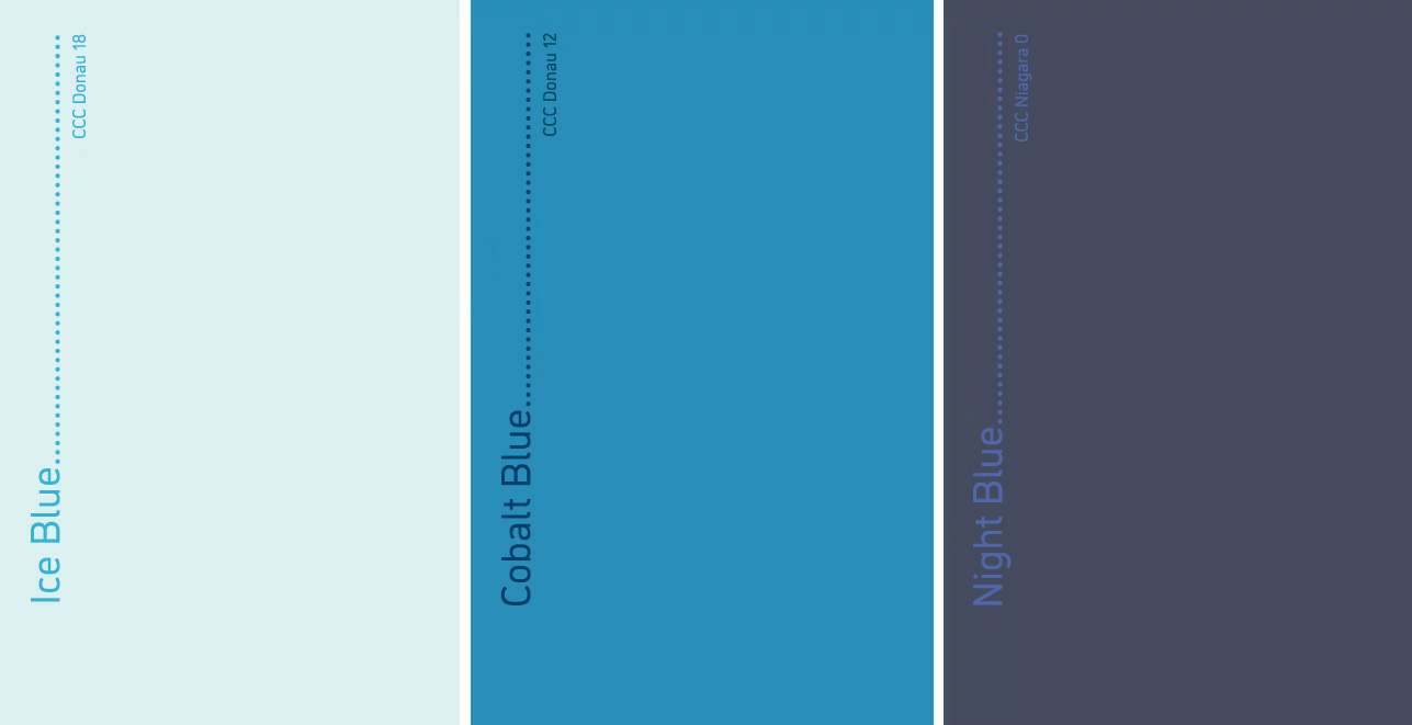
- Ice blue: a clear, cool, fresh and slightly greenish light blue nuance.
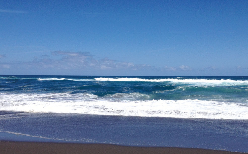
- Ocean Blue: describes dark blue nuances reminiscent of the deep blue of the sea. Strongly luminous nuances bring excitement and freshness, gray shades of this colour direction look elegant and noble.
- Smoky blue: denotes grey shades of blue that provide a sophisticated and modern look.
- Royal Blue: the name of this wall colour goes back to the uniforms worn by the bodyguards of French kings in the 16th century. Royal blue is also called royal blue and is a deep blue radiant colour.
- Pigeon blue: the colour is similar to smoky blue, the name is derived from the grey-blue plumage of certain pigeons.
- Sky blue or pastel blue: a light shade of blue with a high proportion of white - there are creamy, luminous nuances that are similar to baby blue or more veiled, pale variants.
- Denim Blue: blue jeans used to get their hue from indigo, a vegetable dye. The popular deep blue shade is also available as a wall paint.
- Night blue: as the name suggests, this is a dark, deep almost black shade of blue, like the sky at night.
- Nordic Blue: a hue inspired by Scandinavian colour schemes, containing elements of light blue and grey. This wall colour is similar to powder blue and smoky blue.
- Petrol: means dark, deep shades between blue and green - depending on the nuance, it is petrol blue (if the blue component predominates) or petrol green (if the green dominates) - lightened nuances are turquoise blue or mint green.
- Ultramarine blue: natural ultramarine blue is an intense, bright blue pigment extracted from the rock lapis lazuli. Wall paint in this special shade gives every wall a noble and strong appearance.
Combine blue colour
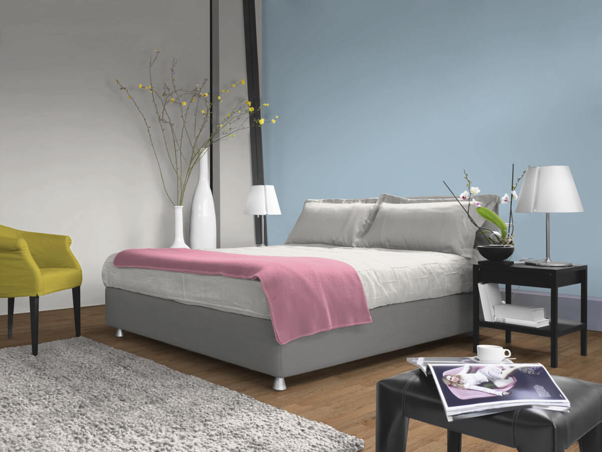
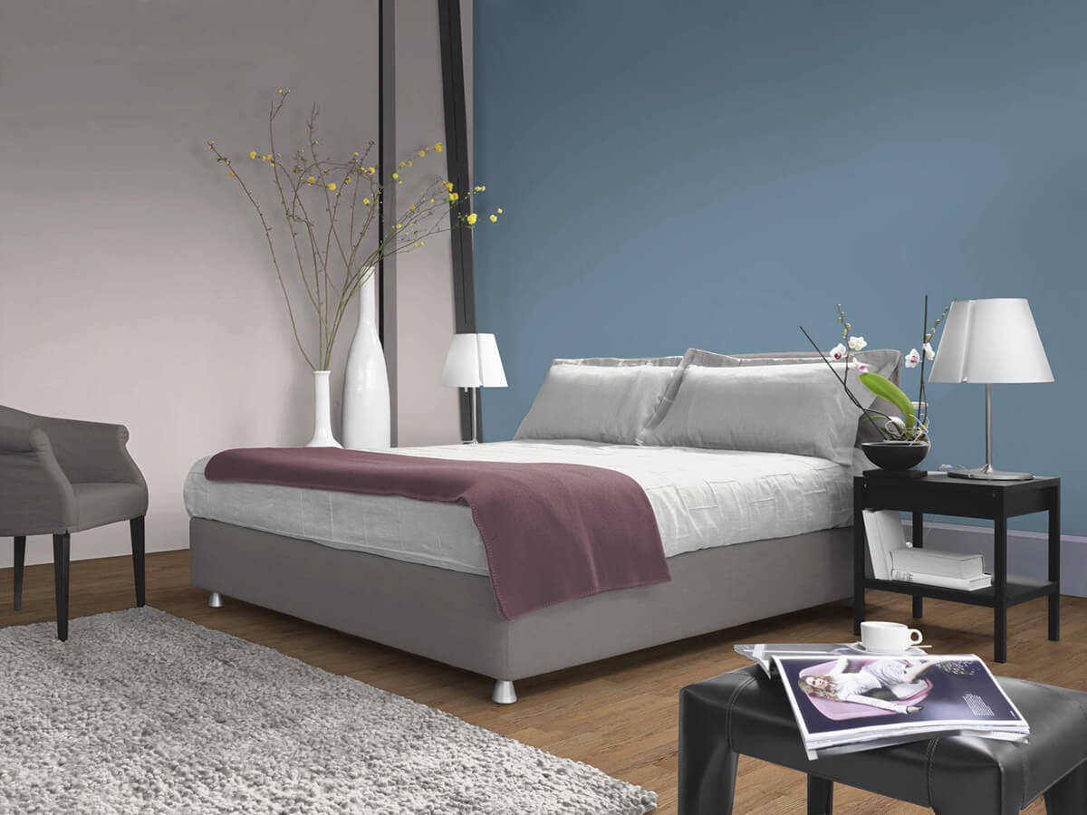
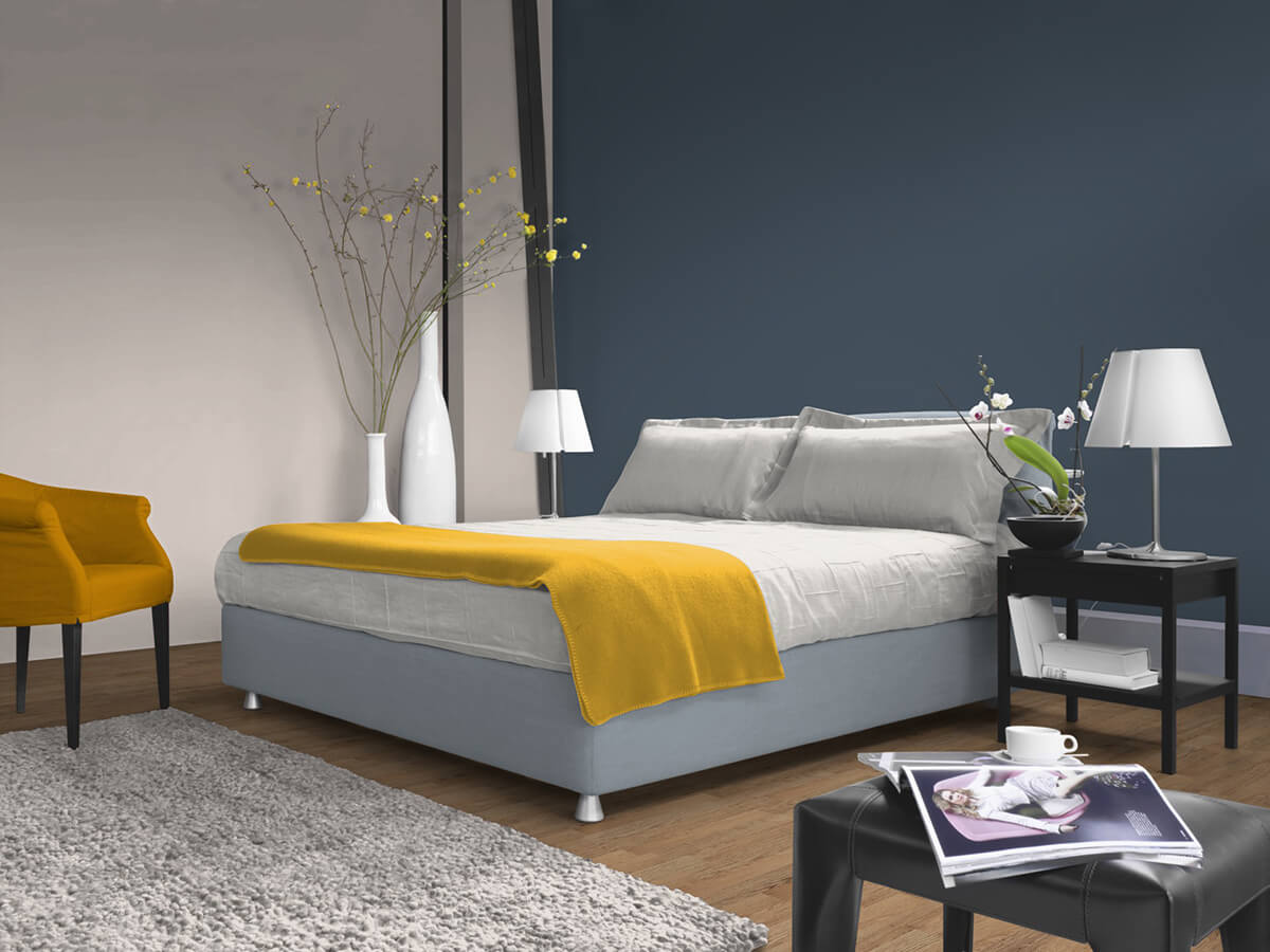
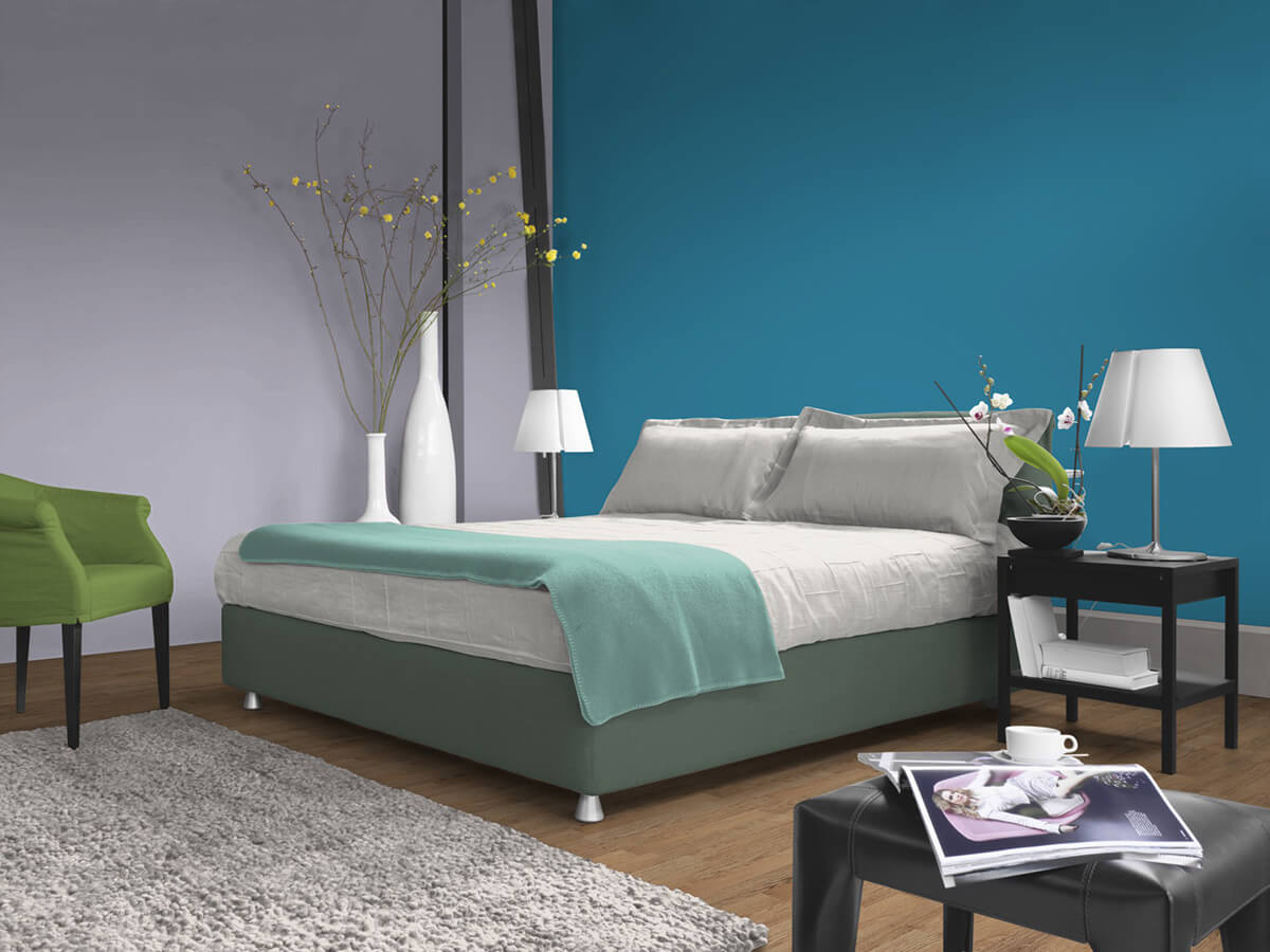
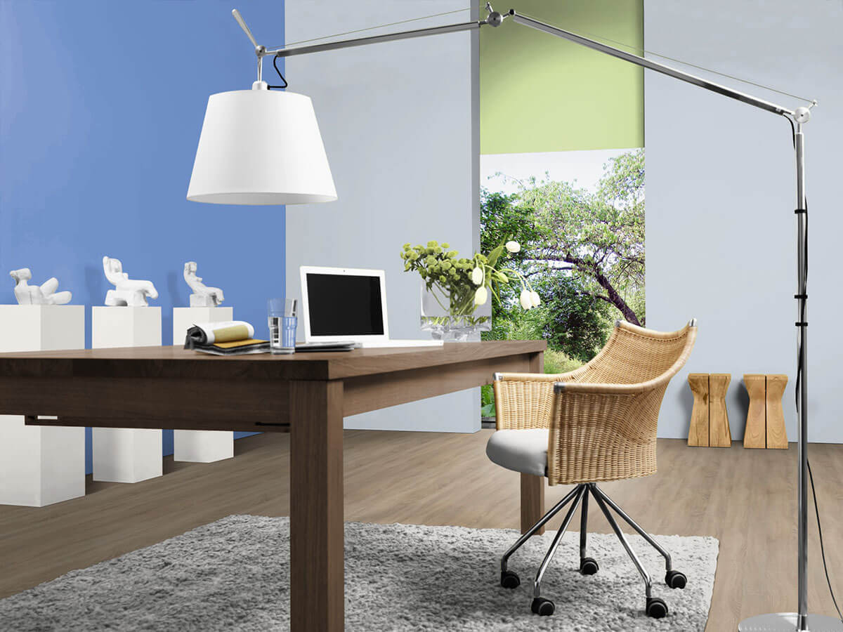
Shades of blue can be combined in many ways in the interior. Tone-on-tone shades of blue can create a refreshing ambience, such as light turquoise for the main walls with a dark smoky blue accent wall, or delicate smoky blue with a classy ultramarine blue wall.
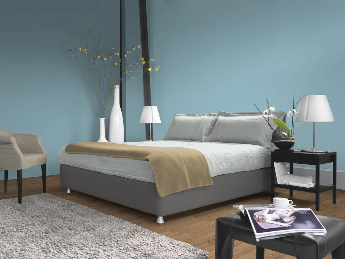
The combination with subtle tones such as white, beige, grey or brown nuances creates a relaxing ambience - ideal for bedrooms, living rooms or bathrooms.
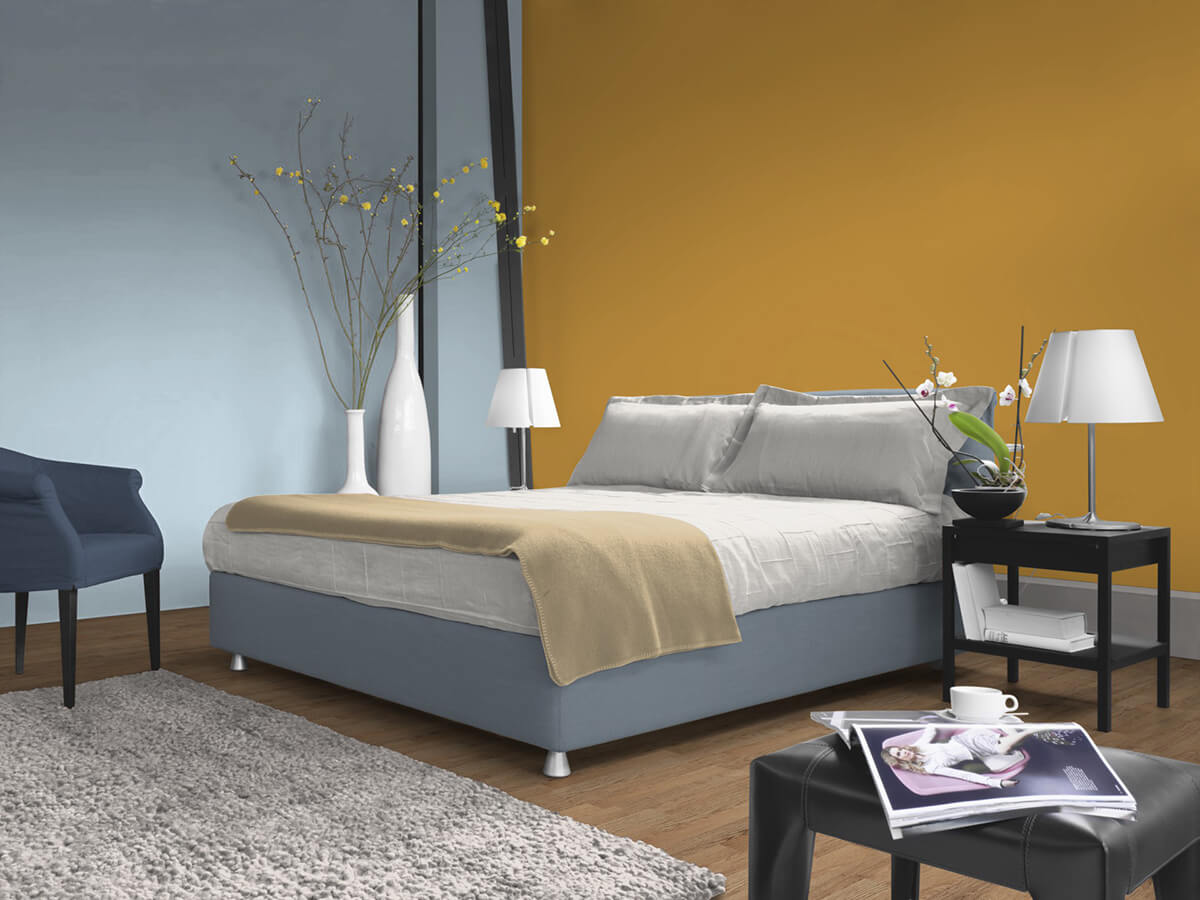
The complementary colours of blue are yellow and orange. This means that these colour areas are opposite each other on the colour wheel and thus represent the strongest contrast to blue. If the blue interior colour is combined with yellow and orange, this creates a very high-contrast and lively atmosphere. Tip: Warm-toned wooden furniture is particularly effective in front of blue or blue-grey walls.
With Caparol to the perfect shade of blue
As an expert in the field of colour design, Caparol is always at your side with help and advice. Are you planning a project and are still undecided about the colour concept? Here the Caparol colour design studio offers the perfect inspiration with over 40 years of experience and know-how. Our competent designers and architects will be happy to advise you individually.
If you have already selected one or more colour tones, we recommend our colour sheet mailing service. With the original colour sheets in the larger DIN A5 format, you can better assess the colour effect in the room. Tip: Hold the practical A5 format directly on the planned wall in the room and assess it in daylight and also under electrical lighting. This gives you significantly more security when deciding on the colour. Please note that artificial light can falsify blue tones, with very yellow light the blue tone can appear greener.
If you would like to determine an existing wall colour or a colour surface, it is worth using the powerful ColorReaderPRO colour measuring device. With this handy measuring device, you can determine the exact shade of your sample in just a few seconds.
Conclusion: Refreshing effects with blue
Interior colour in shades of blue can create a refreshing to relaxing atmosphere in rooms that radiates calm and harmony. Because of these properties, blue is recommended in preference in the bedroom and in rooms intended for relaxation or concentration. Numerous shades of blue are available. They differ from each other in the colour effect - depending on brightness, luminosity and proportions of other colour areas such as green. Blue can be combined well with subtle colours such as white, beige and brown - it looks very natural and therefore calming. In combination with yellow and orange, a very lively impression is created. Caparol offers numerous services and offers to make it easier for you to choose the perfect shade of blue for your project.