


- Home
- Expert knowledge
- Shades of grey
Wall paint in grey for styles that stand out
Grey as a wall colour is a real all-rounder and by no means dreary and gloomy. We explain how grey works in the interior and show inspiring design examples for wall surfaces in grey nuances. Where and how is grey suitable as an interior colour? What are the most beautiful shades of grey in the palette and how do you combine them with other colours? Caparol's design service, which we present here, is also helpful.
How does grey work?
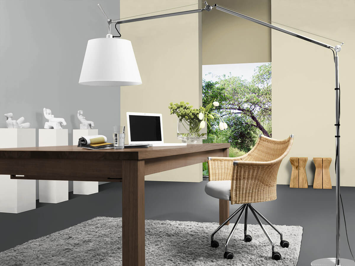
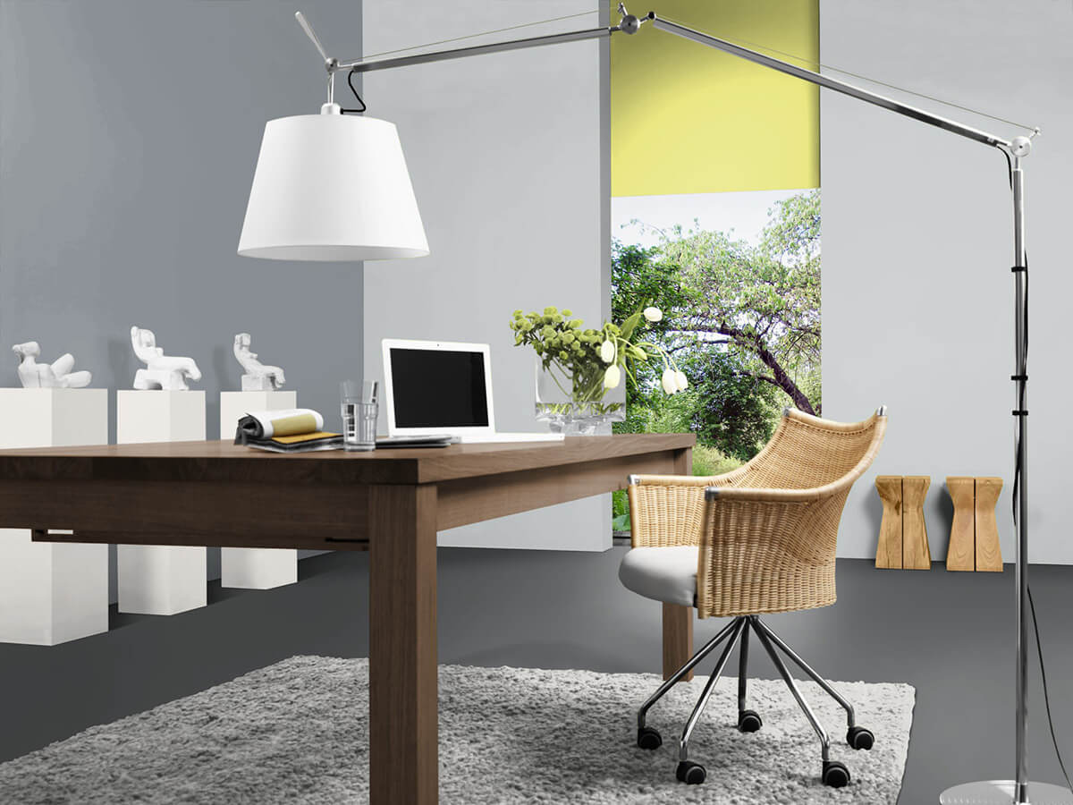
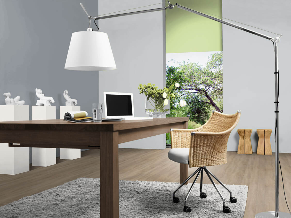
The colour grey is initially a neutral colour as a mixture of black and white. The addition of yellow, red or blue creates a wide variety of grey nuances: from light cool tones to warm velvety nuances to powerful dark gradations. Therefore, grey walls can appear puristic and functional, elegant and noble or natural and comfortable - depending on the nuance. An accent wall in dark grey can, for example, be a visual reminder of the strength of massive mountains - a light misty grey can envelop the room in a sober, elegant atmosphere. Grey wall paint is incredibly multifaceted and indispensable for creating a unique ambience.
The diverse colour palette of shades of grey
A colour palette shows the different colour nuances of a colour range - because: not all grey is the same! There are numerous shades of grey wall paint for painting walls, such as concrete grey, taupe or sand grey.
- Light grey: As the name suggests, light grey is a nuance with a high proportion of white. Interior paint in this shade, similar to white, gives walls a modern and calm look. A classic light shade of grey is light grey. Light grey has a subtle effect and can be used for all walls in the room.
- Concrete grey: Wall paint in concrete grey gets its name from the colour of the building material. This warm grey tone is significantly darker than light grey and has a warmer tone, it creates a naturally rough look and is a good background for coloured or light-coloured furniture.
- Sand grey: This shade of gray goes in the grey-reddish or grey-yellowish direction and is therefore also warm-toned. One also speaks of warm stone nuances. They look natural and calm and are perfect for the classic living room.
- Grey-beige or also called greige are color nuances in the field of tension between gray and beige. As a light nuance, this interior color creates warm, sandy-looking walls that, with white furniture, give the room a light, friendly impression. This color direction is timeless and can be combined in unlimited ways - with white as well as with bright or dark shades.
- Taupe: refers to brownish to reddish shades of gray that create a fine and elegant look.
- Silver: a shiny, metallic cool shade of gray that looks modern and distanced and can add dynamism to color combinations.
Grey is ingeniously combinable
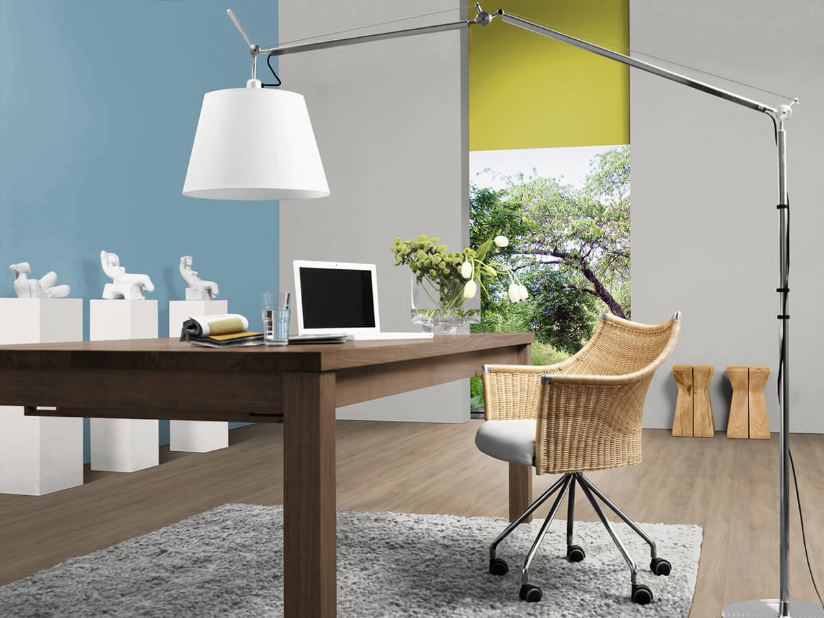
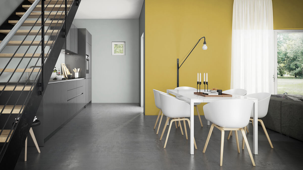
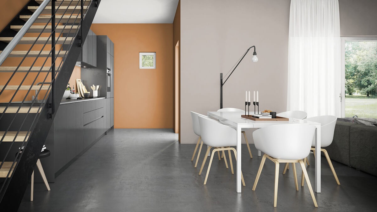
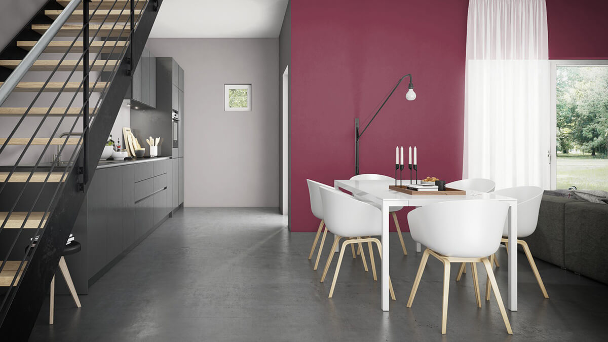
Grey harmonises with almost all colours. Grey walls are visually restrained and make other colours in the room shine. As a visually supporting colour, grey also enables the use of very strong shades such as red, pink or grass green. The lively contrast of static lead grey and delicate light spring green is exciting. The combination of white and wood is classic and becomes elegant with silver. Refreshing moods are possible with silver grey and clear blue tones. Warm, light grey-beige tones are recommended for rooms of security such as cosy living rooms and bedrooms. Study rooms benefit from the calm and concentration that grey tones allow. Accent surfaces in shades of blue, yellow-green or yellow are recommended for inspiration.
Helpful services from Caparol
Caparol offers the following services to make it easier to choose from the large range of shades of grey: The practical 3D-System-Plus colour fan contains 1368 colour tones for architectural design. These include 48 shades of grey in four gradation series, which show neutral, reddish, yellowish and bluish grey nuances. This makes it much easier to select the desired shade of grey. You can also be inspired online with an overview of the colour selection with the Caparol Colourpicker. Here you will find all Caparol colours presented digitally and optimized for computer screens. Please note that the colour tones on the monitor can still be displayed incorrectly. For a safe colour selection, we recommend our original colour shade sheets in DIN A5 format or creating a sample area.

Conclusion: shades of grey are indispensable
- Both discreetly elegant room envelopes and strong accents can be designed with grey.
- The colour palatte of grey is diverse and ranges from neutral shades to trendy nuances such as taupe or greige, which have colour casts of brown and beige.
- Elephant skin does not describe a grey hue, but is a liquid agent used to seal a coat of paint.
- Gray has a reserved effect in the room and makes all other colours shine - shades of grey can be combined in many ways.
- Caparol offers a wide range of interior paints for a wide variety of requirements, which are available in numerous shades of grey.